Tech Casa

iPhone Now Comes With Free WiFi At All AT&T Hotspots

Posted in Technology by thinkabouttech on October 29, 2008

AT&T just sweetened the pot for all of its iPhone subscribers. If you own an AT&T iPhone, you now get free WiFi access at AT&Ts 17,000 hotspots across the country, including at most Starbucks. Although just last summer AT&T teased customers with the same freebie service, only to put up a pay wall afterwards, this time it looks like the free WiFi is here to stay.

So if you live in a part of the country where AT&T’s 3G data network is spotty, you can now supplement that coverage with AT&T’s WiFi network. It is a nice a bundle. You want to go with the WiFi connection whenever you can get it, regardless.

But why is AT&T doing this? It’s not to seal customer loyalty. The two-year contract does that. Perhaps it is to make up for lapses in its 3G coverage, or simply to take some of the load off the 3G network so that everybody’s mobile Web surfing doesn’t slow down.

(source)

ADVERTISEMENT
Create videos for your blog with scate ignite 4

Microsoft Windows 7 First Look: (Hope) The Big Vista Fix – Slideshow – Screenshots

Posted in Microsoft, Technology by thinkabouttech on October 29, 2008
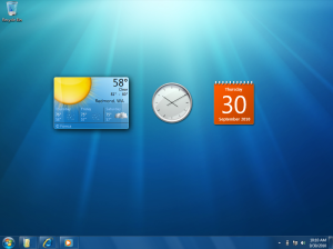
Windows 7 Desktop Gadgets

Windows 7 Desktop Gadgets

At PDC yesterday, Microsoft gave the first public demonstration of Windows 7. Until now, the company has been uncharacteristically secretive about its new OS; over the past few months, Microsoft has let on that the taskbar will undergo a number of changes, and that many bundled applications would be unbundled and shipped with Windows Live instead. There have also been occasional screenshots of some of the new applets like Calculator and Paint. Now that the covers are finally off, the scale of the new OS becomes clear. The user interface has undergone the most radical overhaul and update since the introduction of Windows 95 thirteen years ago.

Click to view the slideshow of Windows 7 screenshots

First, however, it’s important to note what Windows 7 isn’t. Windows 7 will not contain anything like the kind of far-reaching architectural modifications that Microsoft made with Windows Vista. Vista brought a new display layer and vastly improved security, but that came at a cost: a significant number of (badly-written) applications had difficulty running on Vista. Applications expecting to run with Administrator access were still widespread when Vista was released, and though many software vendors do a great job, there are still those that haven’t updated or fixed their software. Similarly, at its launch many hardware vendors did not have drivers that worked with the new sound or video subsystems, leaving many users frustrated.

While windows 7 doesn’t undo these architectural changes—they were essential for the long-term health of the platform—it equally hasn’t made any more. Any hardware or software that works with Windows Vista should also work correctly with Windows 7, so unlike the transition from XP to Vista, the transition from Vista to 7 won’t show any regressions; nothing that used to work will stop working.

So, rather than low-level, largely invisible system changes, the work on Windows 7 has focused much more on the user experience. The way people use computers is changing; for example, it’s increasingly the case that new PCs are bought to augment existing home machines rather than replacement, so there are more home networks and shared devices. Business users are switching to laptops, with the result that people expect to seamlessly use their (Domain-joined) office PC on their home network.

As well as these broader industry trends, Microsoft also has extensive data on how people use its software. Through the Customer Experience Improvement Program (CEIP), an optional, off-by-default feature of many Microsoft programs, the company has learned a great deal about the things that users do. For example, from CEIP data Microsoft knows that 70% of users have between 5 and 15 windows open at any one time, and that most of the time they only actively use one or two of those windows. With this kind of data, Microsoft has streamlined and refined the user experience.

The biggest visible result of all this is the taskbar. The taskbar in Windows 7 is worlds apart from the taskbar we’ve known and loved ever since the days of Chicago.

Text descriptions on the buttons are gone, in favor of big icons. The icons can—finally—be rearranged; no longer will restarting an application put all your taskbar icons in the wrong order. The navigation between windows is now two-level; mousing over an icon shows a set of window thumbnails, and clicking the thumbnail switches windows.

ADVERTISEMENT
Create videos for your blog with scate ignite 4

Right clicking the icons shows a new UI device that Microsoft calls “Jump Lists.”

They’re also found on the Start Menu.

Click to view the slideshow of Windows 7 screenshots

Jump lists provide quick access to application features. Applications that use the system API for their Most Recently Used list (the list of recently-used filenames that many apps have in their File menus) will automatically acquire a Jump List containing their most recently used files. There’s also an API to allow applications to add custom entries; Media Player, for example, includes special options to control playback.

This automatic support for new features is a result of deliberate effort on Microsoft’s part. The company wants existing applications to benefit from as many of the 7 features as they can without any developer effort. New applications can extend this automatic support through new APIs to further enrich the user experience. The taskbar thumbnails are another example of this approach. All applications get thumbnails, but applications with explicit support for 7 will be able to add thumbnails on a finer-grained basis. IE8, for instance, has a thumbnail per tab (rather than per window).

Window management has also undergone changes. In recognition of the fact that people tend only to use one or two windows concurrently, 7 makes organizing windows quicker and easier. Dragging a window to the top of the screen maximizes it automatically; dragging it off the top of the screen restores it. Dragging a window to the left or right edge of the screen resizes the window so that it takes 50% of the screen. With this, a pair of windows can be quickly docked to each screen edge to facilitate interaction between them.

Another common task that 7 improves is “peeking” at windows; switching to a window briefly just to read something within the window but not actually interact with the window. To make this easier, scrubbing the mouse over the taskbar thumbnails will turn every window except the one being pointed at into a glass outline; moving the mouse away will reinstate all the glass windows. As well as being used for peeking at windows, you can also peek at the desktop.

Peeking at the desktop is particularly significant, because the desktop is now where gadgets live. Because people are increasingly using laptops, taking up a big chunk of space for the sidebar isn’t really viable; Microsoft has responded by scrapping the sidebar and putting the gadgets onto the desktop itself. Gadgets are supposed to provide at-a-glance information; peeking at the desktop, therefore, becomes essential for using gadgets.

The taskbar’s system tray has also been improved. A common complaint about the tray is that it fills with useless icons and annoying notifications. With 7, the tray is now owned entirely by the user. By default, new tray icons are hidden and invisible; the icons are only displayed if explicitly enabled. The icons themselves have also been streamlined to make common tasks (such as switching wireless networks) easier and faster.

The other significant part of the Windows UI is Explorer. Windows 7 introduces a new concept named Libraries. Libraries provide a view onto arbitrary parts of the filesystem with organization optimized for different kinds of files. In use, Libraries feel like a kind of WinFS-lite; they don’t have the complex database system underneath, but they do retain the idea of a custom view of your files that’s independent of where the files are.

These UI changes represent a brave move by the company. The new UI takes the concepts that Windows users have been using for the last 13 years and extends them in new and exciting ways. Windows 7 may not change much under the hood, but the extent of these interface changes makes it clear that this is very much a major release.

Click to view the slideshow of Windows 7 screenshots

(by Peter Bright source)

HP Mini 1000 netbook – First Impressions – Check it out – Slideshow

Posted in HP by thinkabouttech on October 29, 2008

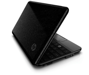
HP Mini 1000

HP Mini 1000

First impressions

The Mini 1000 is easily one of the most attractive netbooks we have seen yet with a smooth black plastic casing that has the HP imprint technology on the lid.  The device is less than an inch thick, one of HP’s design goals, and starts at 2.2 pounds making the Mini 1000 one of the thinnest and lightest netbooks around.  The build quality is superb and feels very sturdy in the hand and could easily take the rigors of traveling.

The first thing we checked out on the Mini 1000 was the keyboard as the outstanding keyboard on the Mini-Note is easily the best on any netbook.  We are happy to report that HP listened to the praise of that keyboard and the Mini 1000 has retained the same keyboard.  This keyboard is 92% the size of a full keyboard and it is tailor-made for touch typing like a banshee.  It feels good to use and has no poorly placed keys which is common on other netbooks.  This is still the best keyboard we have used to date on a netbook and kudos to HP for sticking with what works.

Click here to view the sildeshow

ADVERTISEMENT
Create videos for your blog with scate ignite 4

Specs

The Mini 1000 will come in three different basic configurations: Windows XP, MIE (Ubuntu) and the Vivienne Tam red designer version.  The Vivienne Tam is a designer version and we’ll give some information on it at the end of this article.  We played with all three models which are basically the same except for the specs.  Here are the basic specs depending on the model:

  • N270 Atom 1.6 GHz
  • 512 MB/ 1 GB memory (2 GB on MIE model)
  • 8, 16 GB SSD; 60 GB hard drive (PATA)
  • 3-cell battery (25 WHr); 6-cell optional (52 WHr)
  • 2 USB ports
  • HP Mini Mobile Drive port (2/ 4/ 8 GB; more on this later)
  • Ethernet
  • Combo headphone/ mic jack
  • Expansion port (for optional dock)
  • 802.11 b/g; Bluetooth 2.1 optional
  • Webcam (0.3 MP/ VGA @ 30 fps)
  • SD/ MMC slot
  • 8.9 or 10.2 inch screen (1024×600); glossy

The Mini 1000 keeps basically the same form as the older Mini-Note but now offers two screen size options.  The original 8.9 inch screen is still available but the welcome addition is the option of a 10.2 inch screen in the same chassis.  Both of these screen sizes now offer 1024×600 and there is no option for 1280×768 as the Mini-Note provided.  This is a shame as the higher resolution would be perfect on the 10.2 inch screen but it is no longer available.  The 8.9 inch screen option has a plastic bezel around it but the 10.2 inch has flat glass that stretches from edge to edge of the lid which is very nice.  There is only a glossy screen option which some folks will not prefer but it is very bright and vivid and looks good.

What’s the same as the older Mini-Note?

The first thing we checked out was how the Mini 1000 compares to the older Mini-Note.   We found that for the most part HP kept the good stuff and changed things that could stand improving.  As we’ve already mentioned the keyboard is basically the same and it can’t be stated strongly enough how good it is.  The new netbook also has the same trackpad with the mouse buttons on either side and a scroll area on the right side.  We found that while disconcerting at first the button placement is easy to adjust to and then becomes second nature.  HP kept a trackpad on/off toggle button above the trackpad for those times you use an external mouse.  There is still a wireless on/off switch making it easy to enter flight mode.  The lid retains the Macbook-like hinge behind the unit making the display sit lower than most netbooks.

What’s missing?

Our comparison with the Mini-Note wouldn’t be complete if we neglected to mention what we found missing on the Mini 1000 and there are some key features not present.  We told you about the higher resolution screen (1280×768) that the Mini-Note offered uniquely in the netbook world and it’s a shame that it’s no longer available.  The Mini 1000 only offers the netbook standard resolution of 1024×600 which is adequate but the higher res would have been nice on that bigger screen.  Another feature missing that might be important to some folks is the removal of the ExpressCard slot.  It will now be necessary to use a USB modem for 3G connectivity with that option gone.  The Mini 1000 also has no VGA out port but there is a new option to replace it.  The maximum storage option of 60 GB is a far cry from the 120 GB available on the Mini-Note and we wish HP offered a larger drive option.  The two biggest things missing from the Mini 1000 that were included on the Mini-Note will not be missed at all and that is the Via processor and the Windows Vista option.  The Atom and Windows XP are much better options and the Mobile Internet Experience (MIE) option is pretty decent too.

What’s new?

The Mini 1000 has some new features and options that are worth mentioning.  It’s definitely thinner and lighter than the Mini-Note which is very welcome.  The bigger screen option is also a nice change for the better and we can’t emphasize how bright and vivid it displays.  The flat glass bezel over that bigger screen is very welcome too.  There is a new display port that requires an optional cable to connect to VGA monitors which won’t affect most people but may be a negative for those who do presentations.  The Mini 1000 is intended for consumers so HP felt they could save the space of the VGA out port and thus the change.  The new memory expansion slot for units configured with SSDs is a nice method to expand storage capacity.  It’s the size of a sunken USB port and when the 2/ 4/ 8 GB memory card is inserted it fits flush with the case and is seen as an external volume.  Speaking of expansion a nice change is the access panel on the bottom of the Mini 1000 which makes memory expansion very simple.  The 3-cell battery fits here too.  Lastly a nice option that is new and unique among netbooks is the docking solution.  HP will offer a dock that will provide full desktop connectivity ports to extend the functionality of the Mini 1000.  This dock will be available early next year, pricing not yet determined.

HP has moved the stereo speakers to just above the keyboard.  It’s the metal grille that looks like a hinge and we are happy to report that the Mini 1000 plays audio just as loud as the Mini-Note did.  The sound quality will not replace your home stereo but it’s easily as loud as any notebook you’ll run across.

Mobile Internet Experience (MIE)

As stated the Mini 1000 is available with two operating system options, Windows XP home and Linux.  The Linux version is Ubuntu and HP has developed the Mobile Internet Experience (MIE) shell sitting on top of it to appeal to novice users.  We played with the MIE for a good bit and we are impressed how decent the user experience is using it.  Basically it is a home screen that provides easy access to the most common tasks that users will perform.  The left of the screen is devoted to email access and you can read the most recent emails right on this screen.  There is a little search box that provides multiple functions.  Enter a search term and it opens the browser to present the results.  Enter a URL in the search box and you are taken right to that web page.  This browser is a Firefox-based version that works nice and easy.   The home page also displays the thumbnails for the four most recently visited web pages for easy returning with one click.

The MIE screen gives easy access to photos and the media player which worked as expected.  The MIE was extremely snappy and well done and it’s easy to see how it is the way to go for novices.  There is an easy way to add programs using the MIE that will only offer Linux programs that HP has certified as working with the device.  Of course Linux folk can pretty much do what they want as the system is not overly restrictive.  The Windows key on the keyboard is replaced by an HP key on the MIE models and pressing this key takes you straight to the MIE home key.  The MIE functionality is very well done and even though what we used is an early prototype it worked fine.  This version will not be available until January of next year as it’s still under development.

Pricing and availability

We saved the most critical information for last and that is the MSRP pricing.  The entry level Windows XP model will run $399 and includes the 8 GB SSD, 512 MB of memory, 8.9-inch screen and WiFi (no Bluetooth).  The top-of-the-line Windows XP model will run $499 and include 1 GB of memory, 60 GB hard drive, 10.2-inch display, WiFi, Bluetooth and the web cam.  The $399 configuration listed above will only be $379 with Linux/ MIE instead of XP.  The Windows XP version is available now and HP says it is shipping right away.  The MIE version will be available in January.

The optional 6-cell battery and dock should be available in January or thereabouts but pricing has not been determined by HP. The 6-cell battery will be a wedge that fits on the bottom of the unit.

Vivienne Tam designer edition

The sexy red version was created for HP by designer Vivienne Tam and has a nice red and gold theme along with some attractive peonies on the lid.  This version is the fully tricked out version spec-wise and will retail for $699.  Hey, it will go with your $700 Vivienne Tam shoes.

Click here to view the sildeshow

(by James Kendrick source)

LinkedIn launches Applications Network

Posted in LinkedIn by thinkabouttech on October 29, 2008

LinkedIn has always served a very specific purpose in the business community: helping you find a new job. That utility came in a variety of flavors: posting your resume, looking through job listings, answering questions in hopes of highlighting your intellect, or getting in touch with former co-workers in hopes of landing a new gig. Up to this point, LinkedIn has remained focused but – apart from those invitations to connect – not especially social or dynamic.

With the launch of the LinkedIn Applications platform, they’re hoping to change that by helping “over 30 million professionals on LinkedIn to communicate, collaborate, and share information even better than before.” But they still remain focused on one thing: helping you find a new job.

The initial applications on the platform allow users to build a more dynamic and cohesive picture of the types of employees they are – or can be:

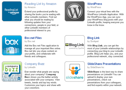
LinkedIn Applications

LinkedIn Applications Platform

Today’s launch features nine resume-enriching applications:

  • Prove you’re more well-read than any of the other candidates with Reading Lists from Amazon.
  • Share your portfolio pieces with potential employers or store that coveted letter of resignation with the file sharing of Box.net Files.
  • Put that girth of presentation material on your machine to work for you with Google Presentation and SlideShare or use the apps to take a “creative” approach to pitching a new employer.
  • Huddle Workspaces? Online job interviews. ‘Nuff said.
  • Show off your acerbic wit and unique insights with Six Apart Blog Link (which supports a variety of blog formats) or WordPress applications that bring your latest blog posts into your profile.
  • Well traveled individuals – or those who are willing to go where the company tells them to go – are always in demand and with My Travel by Tripit you’ll be able to show the lengths – literally – to which you’re willing to go.
  • LinkedIn even offers their own application – Company Buzz – that will help you determine the most appropriate companies for your to pursue.

Visit http://www.linkedin.com for more information.

(source)

Google Launches Google Apps Labs and Welcomes Third Party Developers

Posted in Google by thinkabouttech on October 29, 2008

Lately, Google has rolled out new features for its experimental Google Labs functionality in Gmail at a rapid pace. Today, Google announced a similar product that will bring experimental features to enterprise and small business customers: Labs for Google Apps. These apps are built on top of the Google App Engine, which launched in April, and include Google Moderator, Google Code Reviews, and Google Short Links.

If you are using Google Apps for your Domain, you can head over to the Google Solutions Marketplace and start adding these features to your account now, though you will have to change some of your DNS settings before they can become functional.

Google Code Reviews

Google Code Reviews is, as the name implies, aimed at developers. It allows developers to share code for review and propose changes.

Google Moderator

Google Moderator is an application that Google first released for the App Engine just about a month ago. Moderator is basically a forum for group discussions and Q&A sessions, with the ability to vote questions and answers up and down.

Google Short Links

Short Links is a URL shortener like TinyURL or snurl, but works with your own domain name. This allows you to turn complicated and long URLs into short, more memorable ones.
More to Come

According to Google, these are just the first three in a long list of products that will make their debut in Labs for Google Apps. Google also intends to open this platform up to all App Engine developers, but it hasn’t provided a timetable for this yet.

(by Frederic Lardinois, source)

Microsoft warns of financial crisis email scams – Protect yourself online

Posted in Microsoft by thinkabouttech on October 29, 2008

LONDON–Internet fraudsters will try to exploit the global financial crisis by sending fraudulent emails purporting to offer cash-strapped consumers new mortgages, loans or money from failed banks, a Microsoft executive said on Wednesday.

Tim Cranton, an Internet safety expert at Microsoft, said there are early signs that criminals have already begun trying to cash in on the economic turmoil.

“It’s especially troubling right now with the financial crisis,” he told Reuters in a telephone interview. “There are more and more people who are maybe in a more desperate or vulnerable situation.

“We have seen an increase in some mortgage refinance type of scams. We are anticipating that they’ll become more sophisticated.

“We have seen that with Hurricane Katrina, the (2004 Asian) tsunami and other natural disasters where the scammers immediately jump.”

Fraudsters may send spam emails to consumers that ask them to pay a fee related to the collapse of a bank or financial institution, he added.

“They will allege it is associated with the refinancing — so because of this bailout you’ll get a much better deal on your mortgage and all you have to do is pay this fee.”

Online criminals have long used promises of easy money to try to defraud unsuspecting victims.

Common scams include requests to help move money out of a developing country. People are offered a cut of the fortune if they first pay a release fee.

Or they are told they have won a lottery in a foreign country and will receive a huge jackpot once they pay an administration fee.

A poll for Microsoft on Wednesday found more than a quarter of computer users thought it was likely they would fall victim to an online scam that would cost them money.

Half said the scams made them more wary of shopping online, while more than a third said it led to them being more reluctant to use the Internet at all.

However, the poll suggested that the actual chances of becoming a victim are far lower than the perceived risk.

Of 5,000 people polled across Europe, only 113 had lost money to an Internet fraudster in the last year. That equates to one in 44 of those questioned. Microsoft said it has formed a coalition with Yahoo!, Western Union and the African Development Bank to help spread the message about hoax emails.

“What we’d like to do is raise awareness so that people feel more confident about using the Internet,” Cranton said. “We don’t want to see a reduction in e-commerce.”

* Details on how to protect yourself online are at: http://www.microsoft.com/protect/default.mspx

Story Copyright © 2008 Reuters Limited. All rights reserved.